Icons, pictograms, symbols. You see them every day on your phone, on the subway, at the supermarket, while driving. What does each one represent? How are they different? Fonts or graphics? Free or paid? And just as importantly… when you know you need them, where do you find them?
Symbols are a representation of “something” that is reached through a certain consensus because… in reality, it doesn’t exist; it’s constructed, created. Think of linguistic signs, mathematical signs… and that whole sign-signifier-signified thing (which at the time was never quite clear to anyone).
So, what’s the difference between a symbol and an icon? Good question, a real mess. Icon comes from the Greek EIKON, a root that speaks of image, mixed with Russian and French. Peirce says it’s “a sign that represents an object based on a resemblance to any of its aspects.” In other words, there’s a real relationship between what is represented (reference) and the symbol that is produced (result).
In the real world, we often use symbol and icon interchangeably (because we see signs every day, but we rarely talk about linguistics). A similar dilemma arises when we need to distinguish icons from pictograms. Pictograms are also symbols that represent objects, but they are more synthetic, more schematic, more abstract.
To put it simply, if you’re looking at a fantasy, you’re seeing an icon. If it’s raw, basic, to the point… it’s probably a pictogram. Put another way: you can start with a pictogram and expand it until you have an icon. But be careful, if you overdo it, you might end up creating an illustration.
Invisible? What are you talking about?
We say they are invisible because they often go unnoticed. Because there are few human beings who, beyond interpreting them, perceive them in their full force, reflect on and debate iconographies… Except, perhaps, designers, who dream of graphic arrays and fonts and color palettes and need sightseeing to decide whether fill or line, whether with an edge or a rounded border, whether black and white or full color and now… flat ink or gradients?
“Good design is invisible design”
Don Norman | The Design of Everyday Things
Icons, understood in their broadest sense, are everywhere. And not just randomly: Someone designed them (sometimes not very well). You’ll see them in apps, on your computer, in infographics, but also in food nutrition information, cleaning product warnings, elevators, traffic signs… you name it, everywhere.
This is because they are (or should be) universal. What does that mean? It means that when we see an icon, you, me, my mother, a Sami, and an Argentinian should understand more or less the same thing; the same image should appear in our minds. With nuances, of course. To understand the representation, we all need to know, even if only partially, what it refers to. In short, their universality gives them incredible power to improve accessibility, whether we’re talking about a website, an app, or hospital signage.
Iconographic fonts vs graphic icons (jpg, png, glory-to-svg)
When you’re looking for high performance, pixel-free scalability, low file size, cross-platform compatibility, and overall compatibility, the way forward is to use an icon font or SVG format, whether from an external resource or created from scratch. If they’re going to be used in apps or websites, they’re code, so they load incredibly fast. If they’re going to be used in print or graphic applications, they’re vectors, allowing you to scale them up and down as needed.
The advantage of using existing fonts or icon sets, provided you ensure their quality, is that you eliminate the need for constant verification, corrections, and adjustments. Creating your own font or exporting your own graphics as SVGs seems easy, but the code generated by design programs can be improved, and creating functional fonts is also a skill.
Fonts load faster. SVGs offer more control and, of course, are easier to implement and adapt to the specific characteristics of each brand. If you don’t want to find YOUR ICONS in any other project, the way forward is to rely on professionals who develop a personalized graphic design and, at the same time, ensure its stability.
Where can you find them?
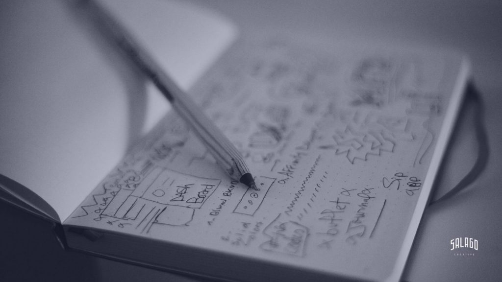
You’ve fainted and you want it all. You want the fonts, you want the graphic icons. You want them for free, you want them for free, you want them all to yourself, you want to share them, you want to get them tattooed. It’s normal, I feel the same way. Here’s a quick list of various resources to get you started.

Font icons:
Fontawesome: Twitter’s CDN icon font. If you’re working on a development project using Bootstrap, they go hand in hand. Solid or lined, it includes branding (logos). It has graphical support (PNG, SVG). Free and paid versions available.
Material Design: Google’s icon font. You have 5 options, with different finishes. Amazing: They adjust in simplicity according to size (responsive, incredible!). Also with graphic support (png, svg). Free and open source. Fantastic.
We love icon fonts: A hosting service like Google Fonts, but only for icons. Free and open source. Note: it’s public, so it’s ideal for experimenting and sketching, but not so great if you have to use it in (digital) production; you could run into security issues.
Icomoon: An engine you can feed with your icons to generate a custom font. Warning: It can crash if you’re not careful. Free and paid versions available.

Graphics:
Ikonate: Their customization tool is intuitive, easy, and effective, which is no small feat when working with brand constraints. Forget about importing, editing, and exporting in graphic design programs. Plus, they guarantee excellent performance. Open source and completely free.
The noun project: Incredibly comprehensive, fantastic for finding conceptual references. Available for free (under a Creative Commons license, so you’ll need to attribute the author) and for a fee. Organized by categories, it functions as a networked repository with work from various community members.
Flaticon: Free and paid stock images. The advantage over iStock, Getty Images, or similar sites is that it focuses on icons, so you save yourself the time of searching and searching through the illustration category. Freepik It also has a section, although it presents them ungrouped (if you need to assemble a battery, hellish search and guaranteed editing).
Are you experiencing Stockholm syndrome? Are you unable to even type?
Write to us and tell us your concept, and we’ll bring it to life. We’ll find a font that fits your project or develop one from scratch. Icons, pictograms, symbols, in sets or individually… at Salago, we even do illustrations. Tell us